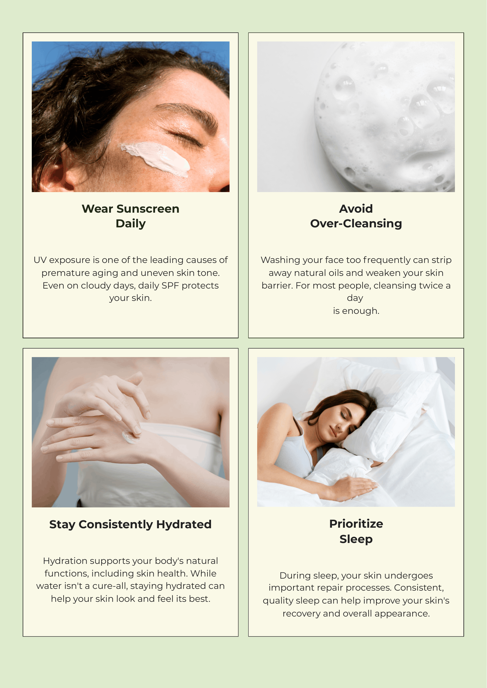
Nuevo Skin & Beauty
Self-care, simplified.
The idea was to make skincare feel less like another step in a routine and more like a small moment for yourself. I wanted Nuevo to feel gentle and approachable, with a visual world that reflects the simplicity behind its products.
Nature, Refined
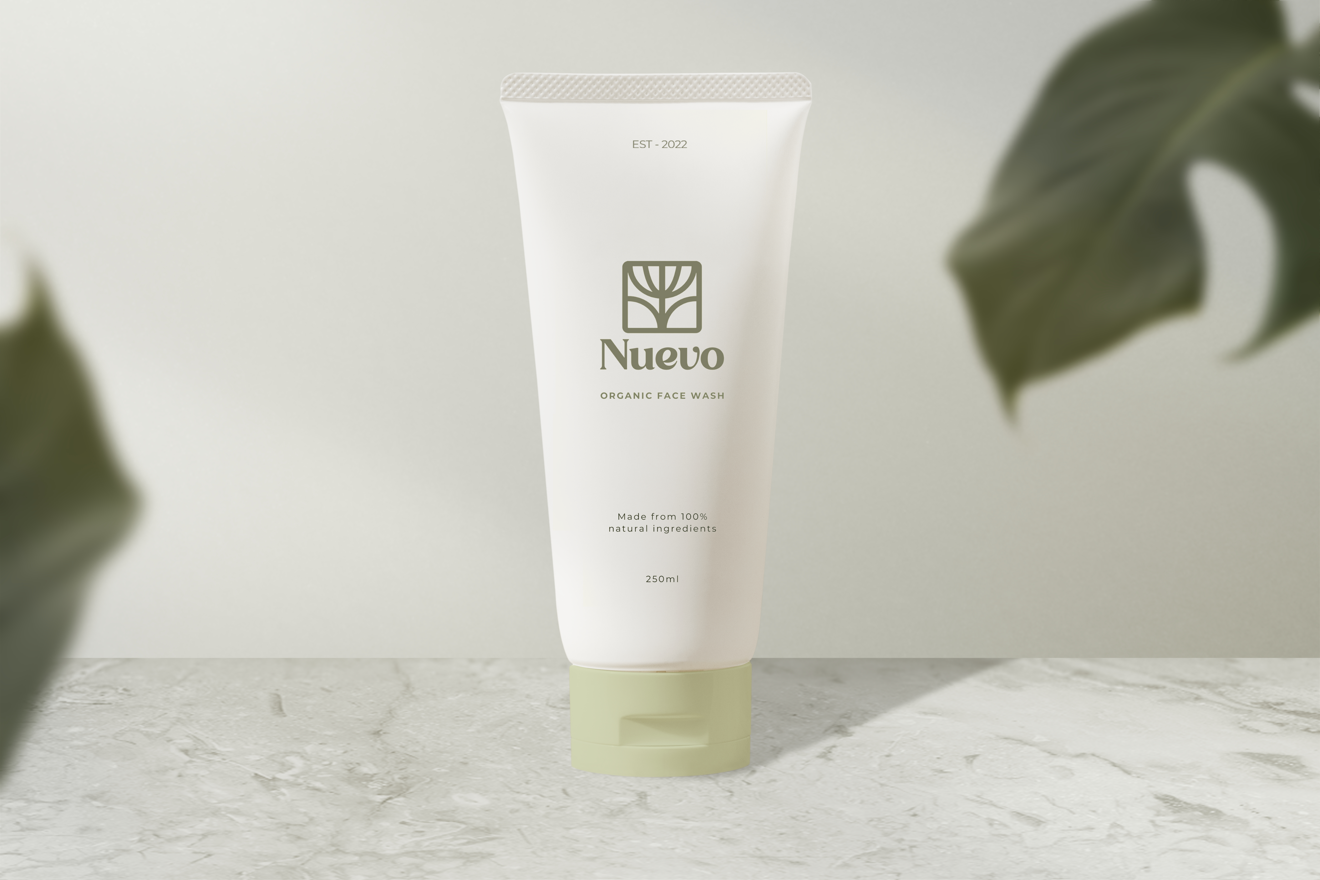
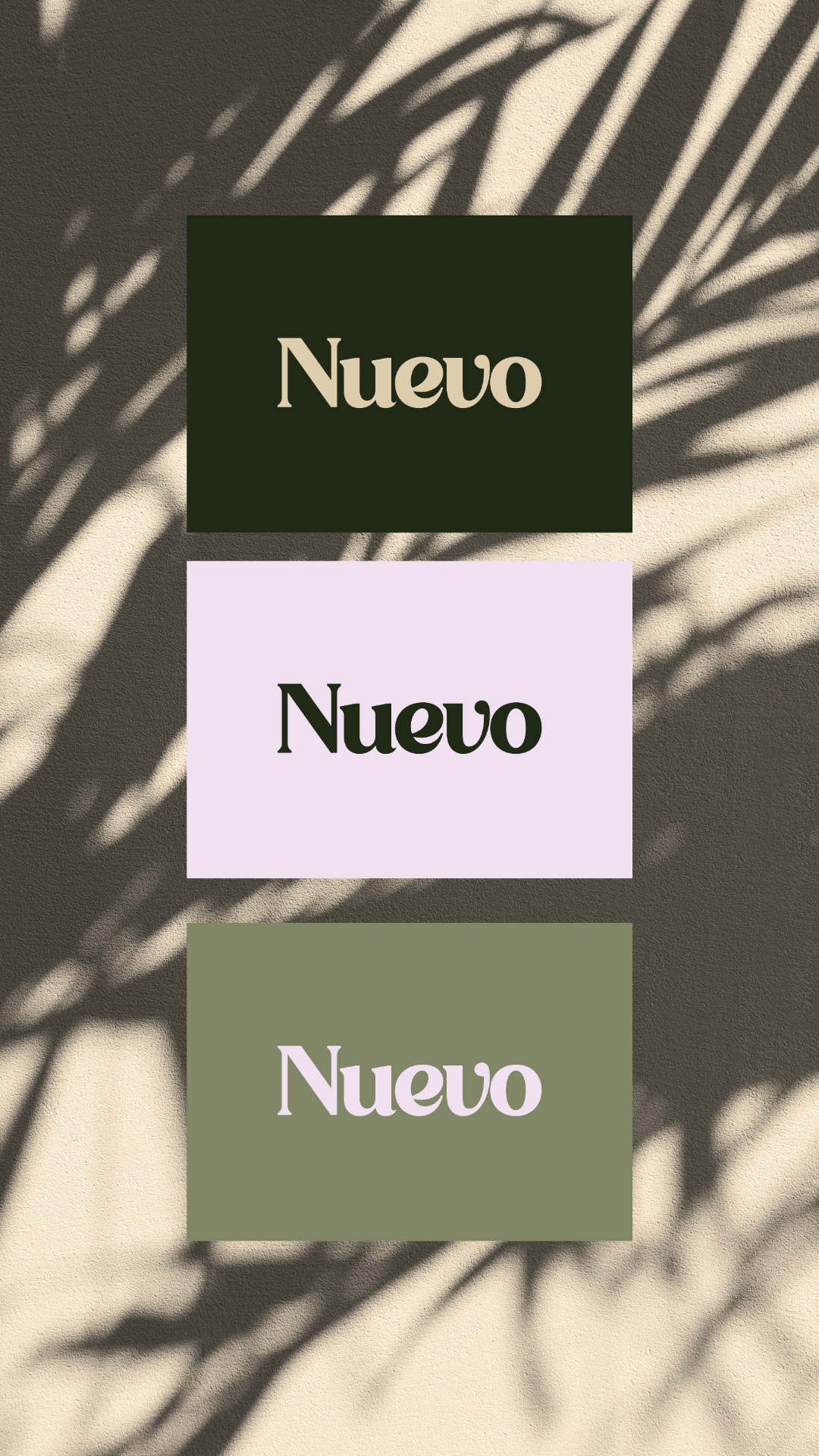
Earthy greens and warm neutrals meet softer pastel tones, balancing the organic with something more feminine and refined. The direction takes inspiration from nature without relying too heavily on the usual “natural skincare” look.
Softness in the Details
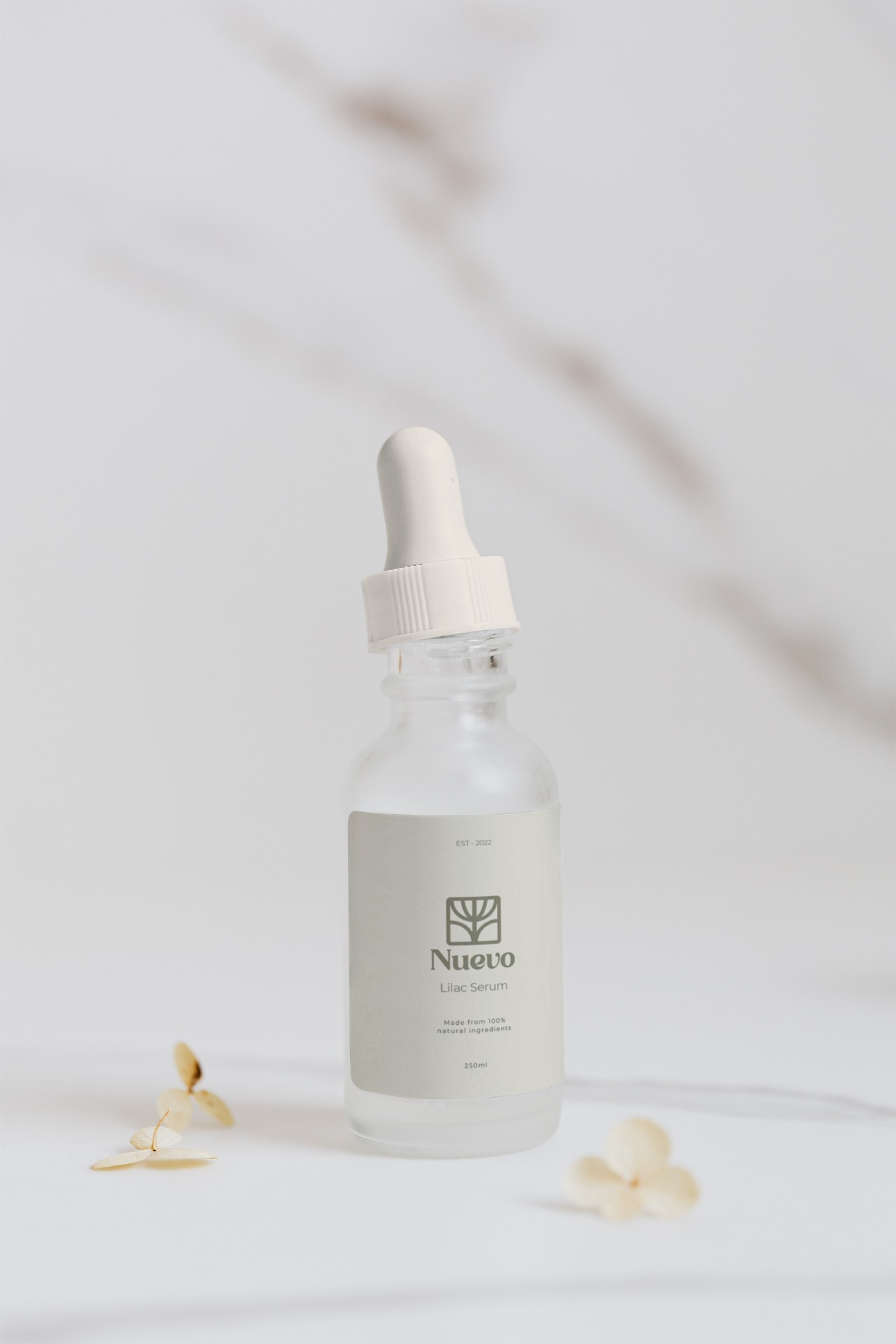
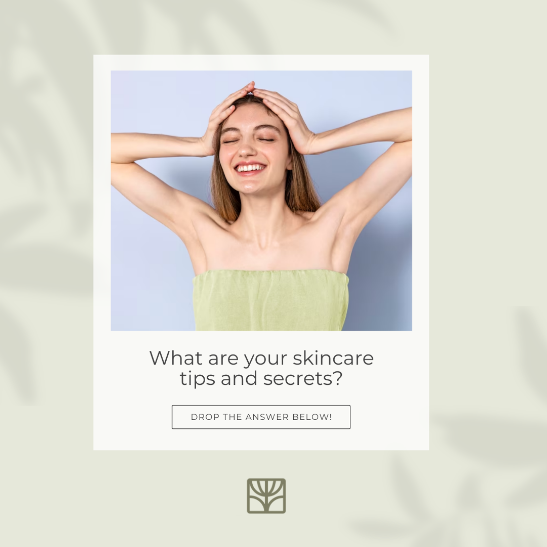
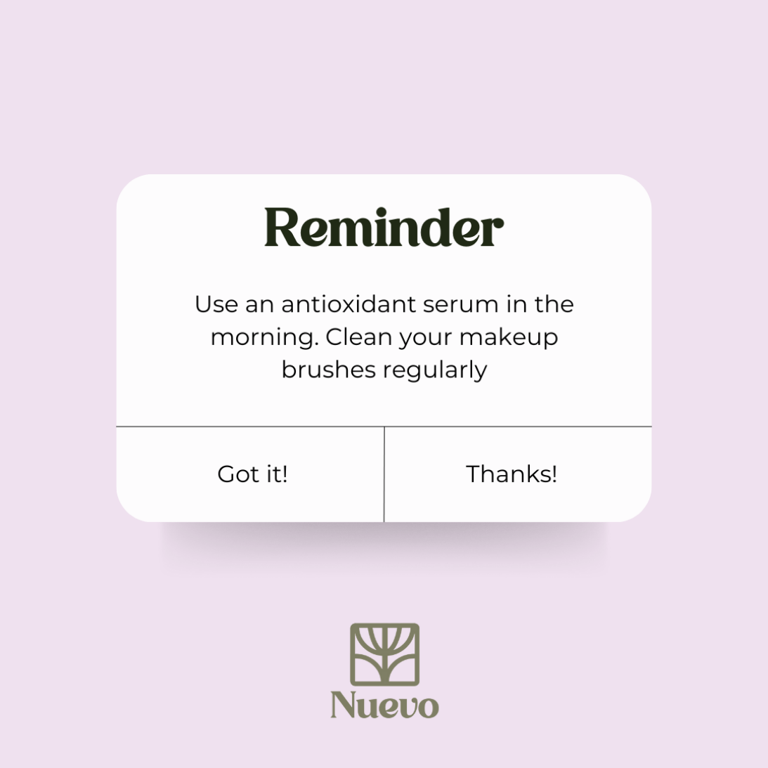
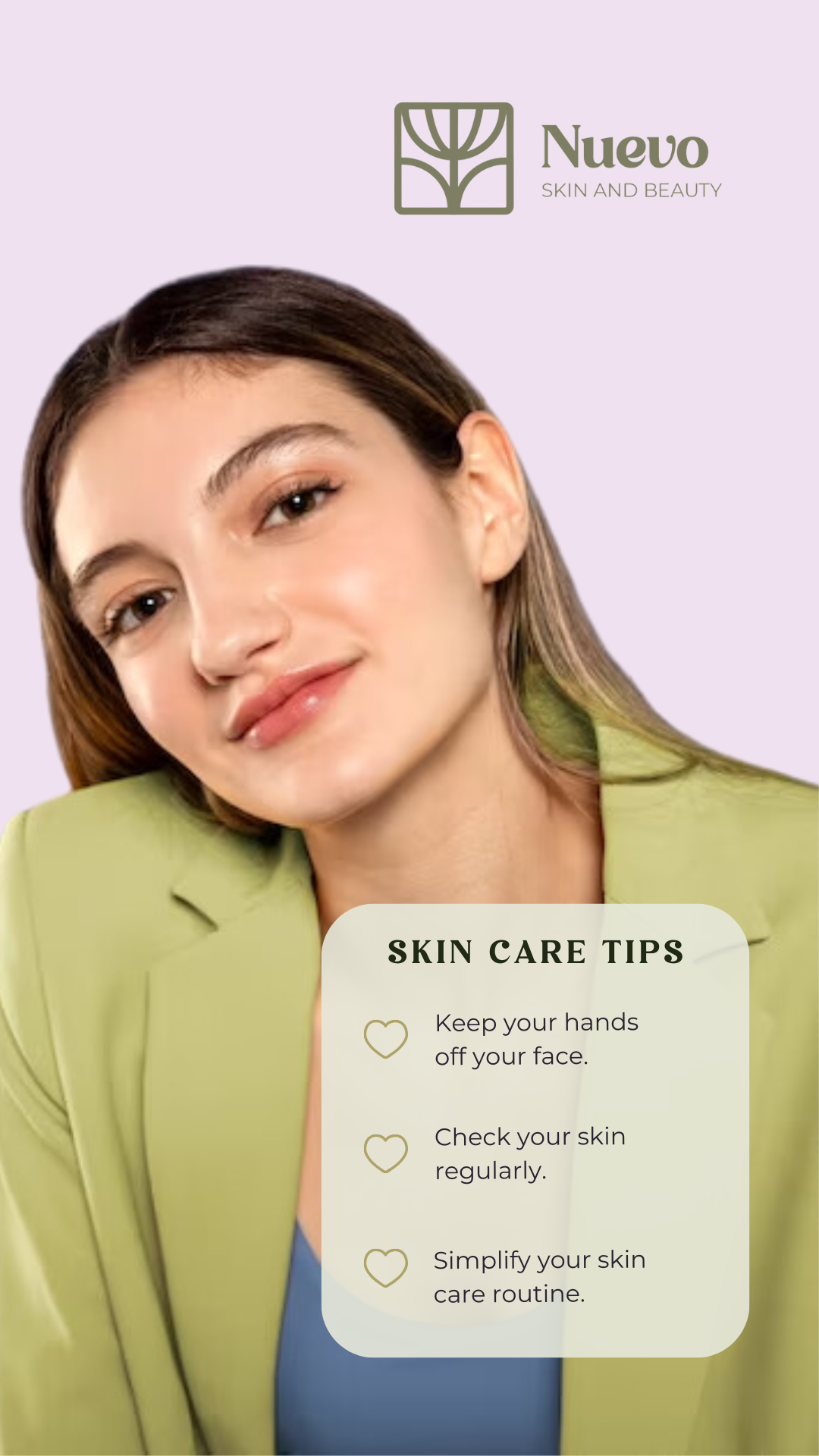
Clean typography, botanical details, subtle textures, and plenty of breathing room shape the identity. I kept the compositions simple so the products could stay at the center while still giving Nuevo a personality of its own.
A Naturally Connected Identity
I carried the same visual language across packaging and digital applications, creating a system that stays recognizable without feeling repetitive. The result feels calm, considered, and unmistakably Nuevo.