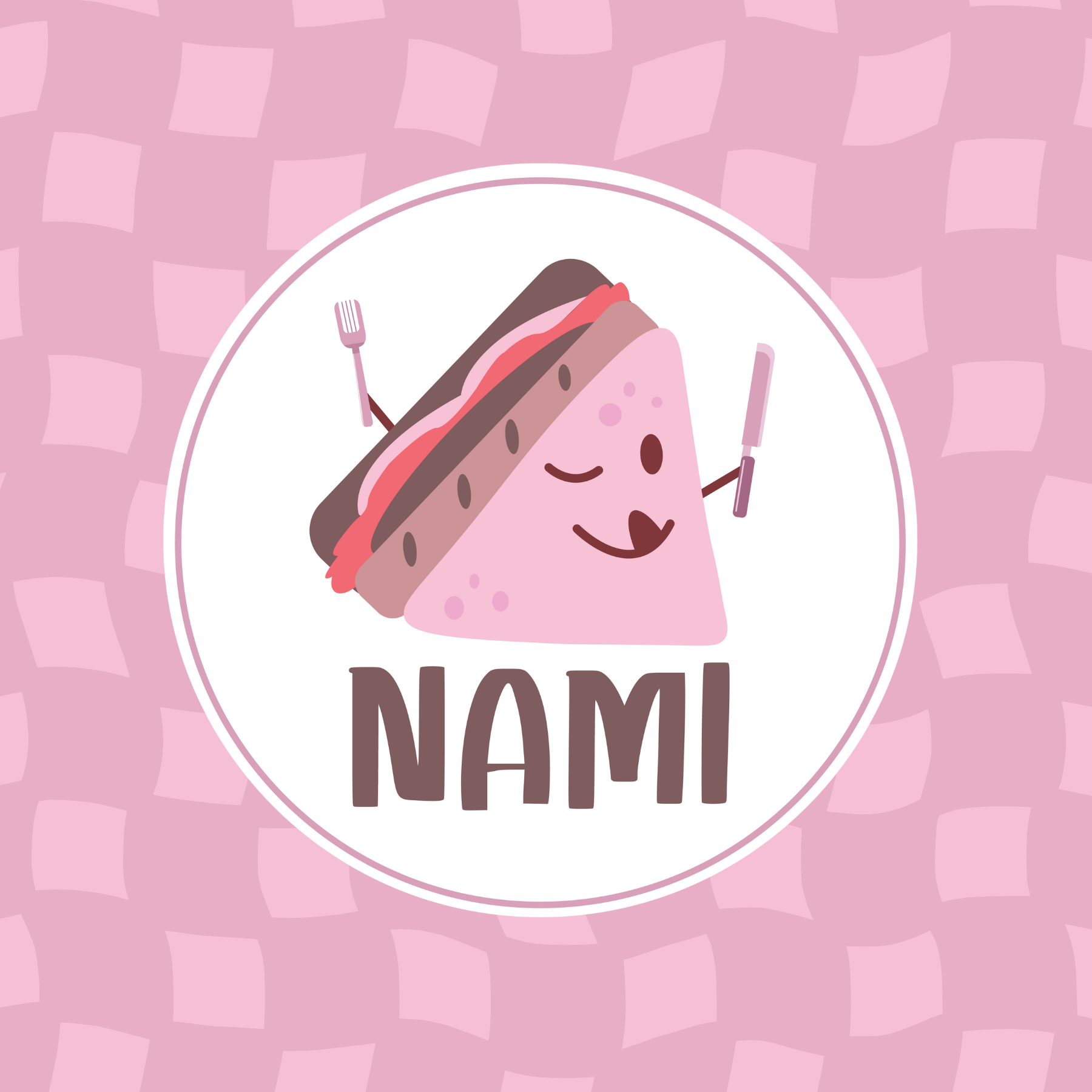
Nami
Food with a Personality
I wanted Nami to be remembered for more than what it served. Instead of building everything around food photography, I explored how illustration could give the brand its own character and make it instantly more personal.
Playful by Nature
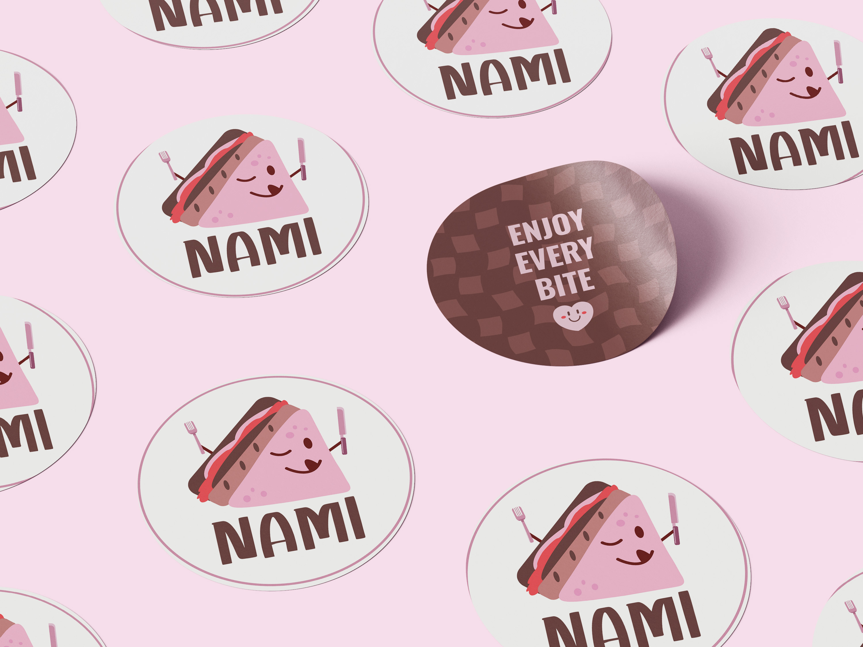
The direction leans into soft pinks, playful typography, hand-drawn details, and a sense of humor. I wanted everything to feel youthful and cheerful without becoming too childish. The result sits somewhere between cute, quirky, and a little unexpected.
Meet Nami
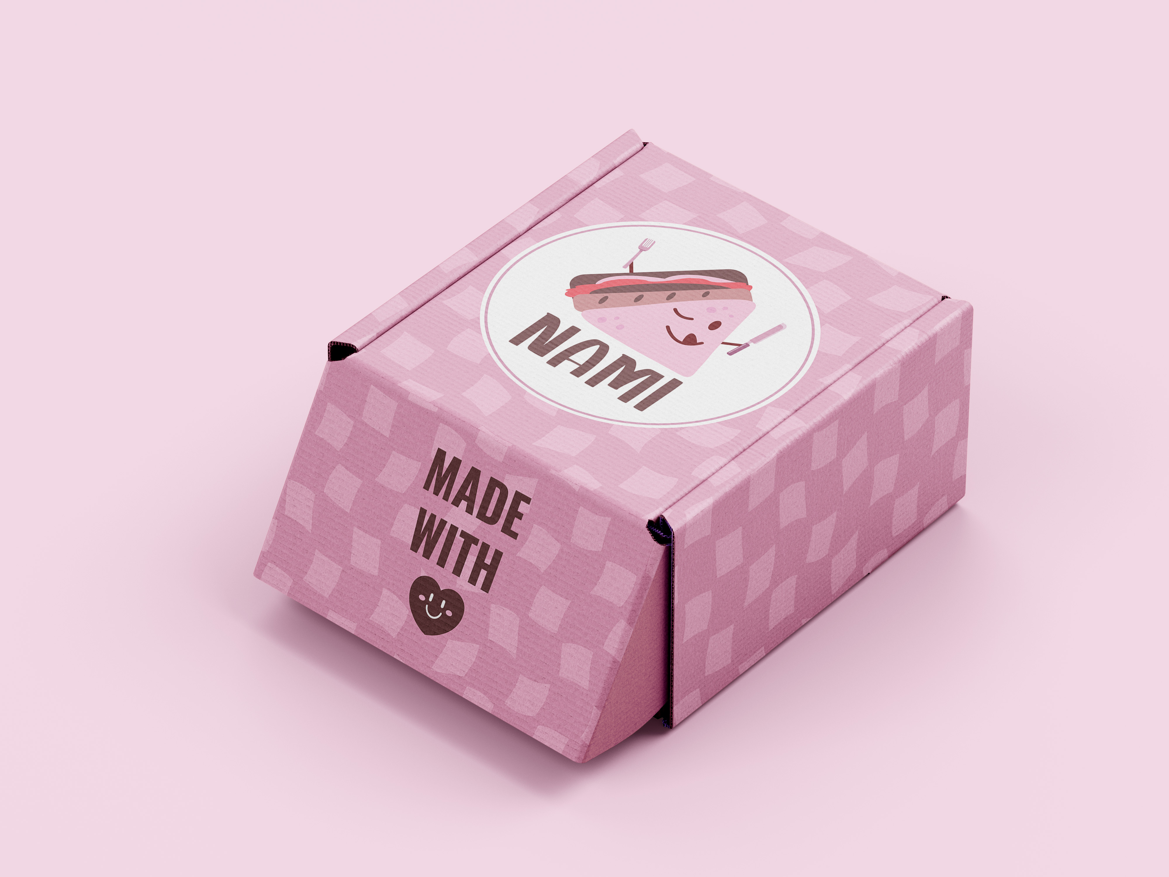
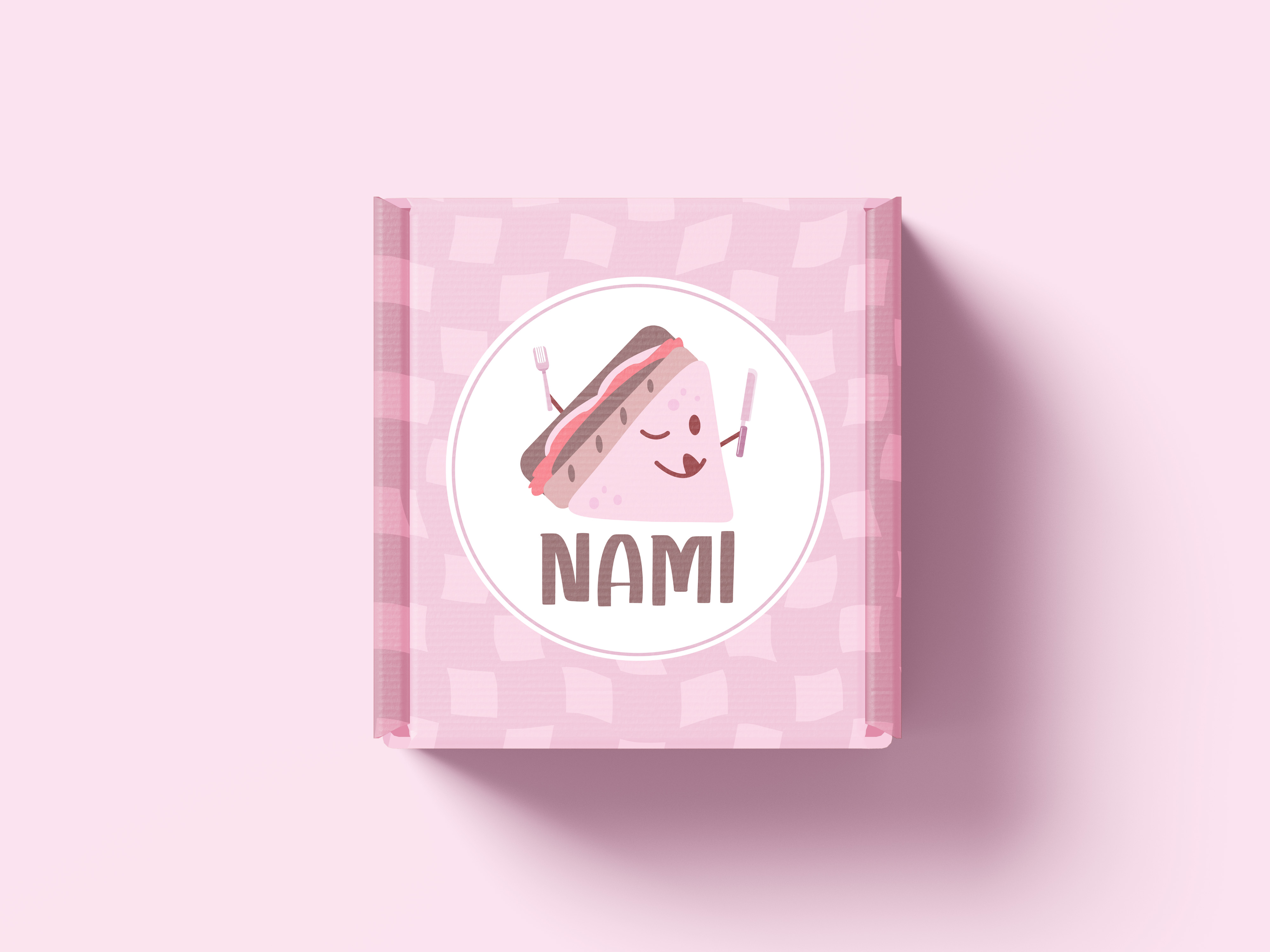
The illustrated sandwich became the heart of the identity. I developed the character alongside the logo and supporting graphics, then brought the same playful language into the packaging. Rather than treating illustration as decoration, I used it as part of how Nami communicates.
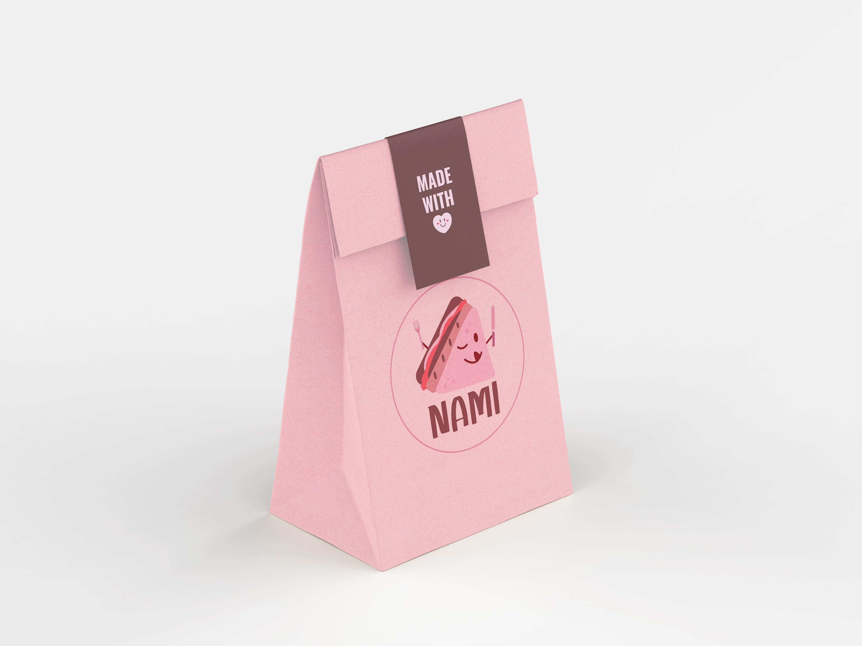
A Personality That Travels
Giving Nami a recognizable character created something the brand could continue building around. The identity can move naturally from packaging to social content, merchandise, or future products while keeping the same playful personality.