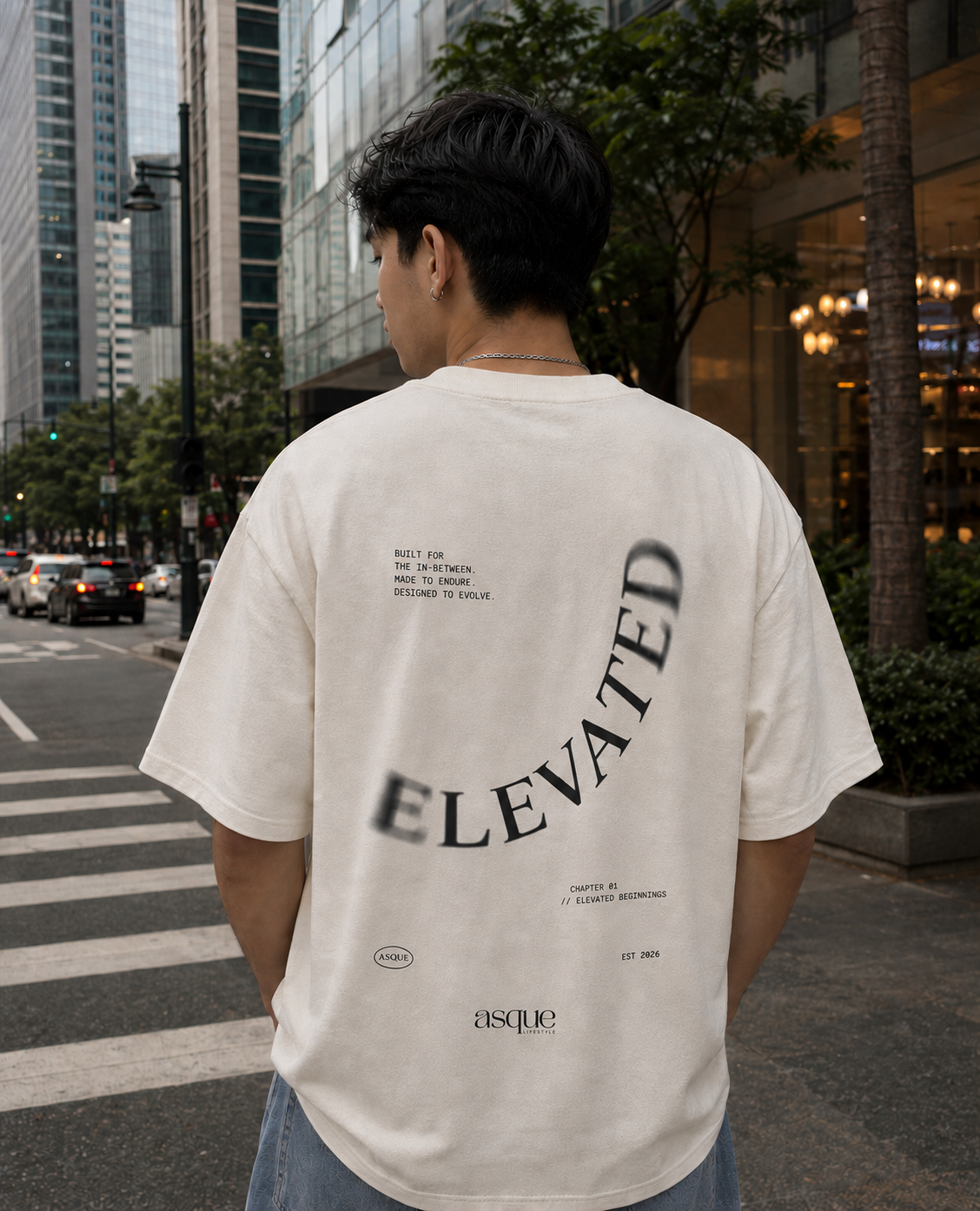
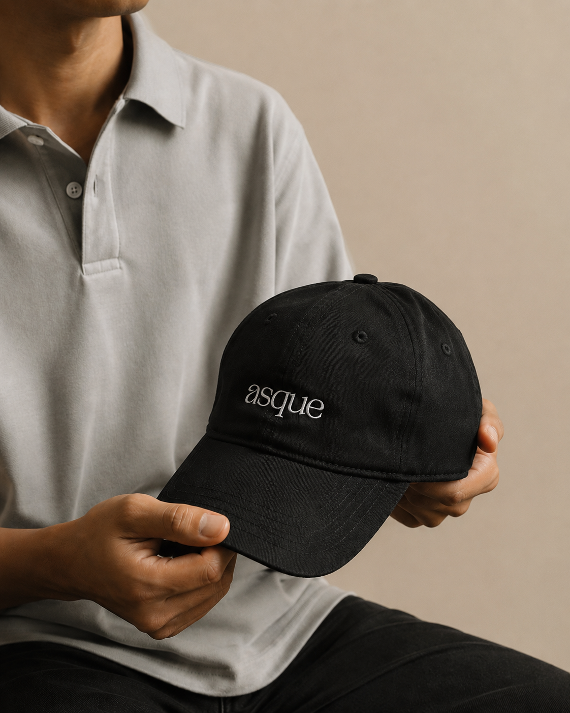
ASQUE Lifestyle
Let Simplicity Speak
ASQUE didn't need to be loud to feel distinctive. I wanted to create an identity where the strength came from restraint: thoughtful details, confident typography, and a look that could sit naturally beside the clothing.
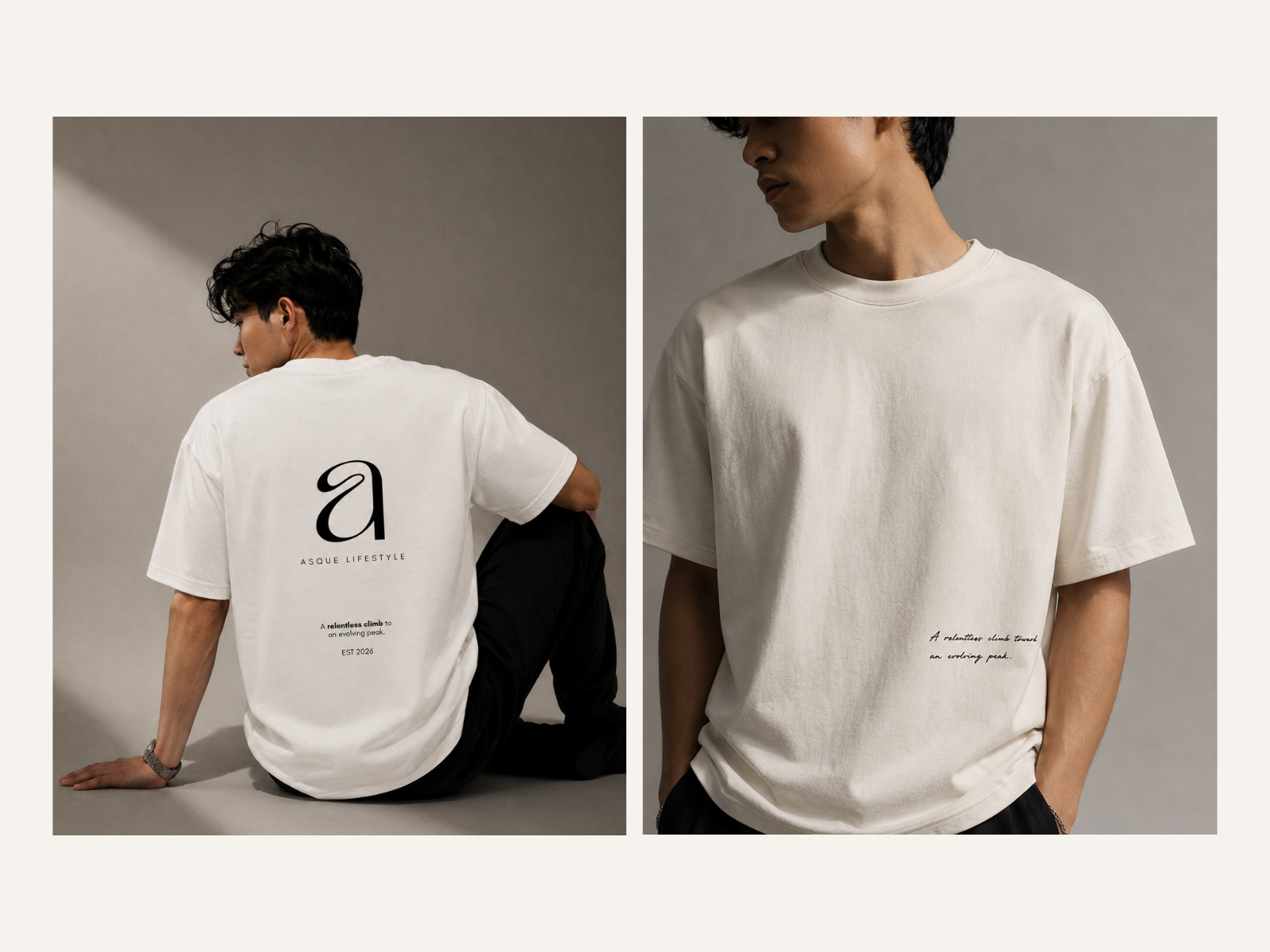
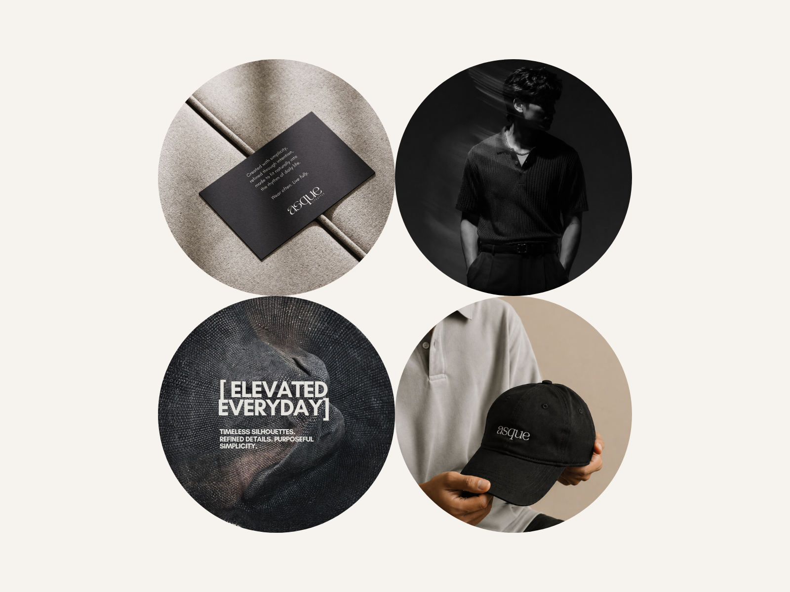
Quietly Distinct
The direction is minimal, but never empty. I worked with a restrained color palette, clean typography, and plenty of space to create something calm and contemporary. Every choice was made to support the clothing rather than compete with it.
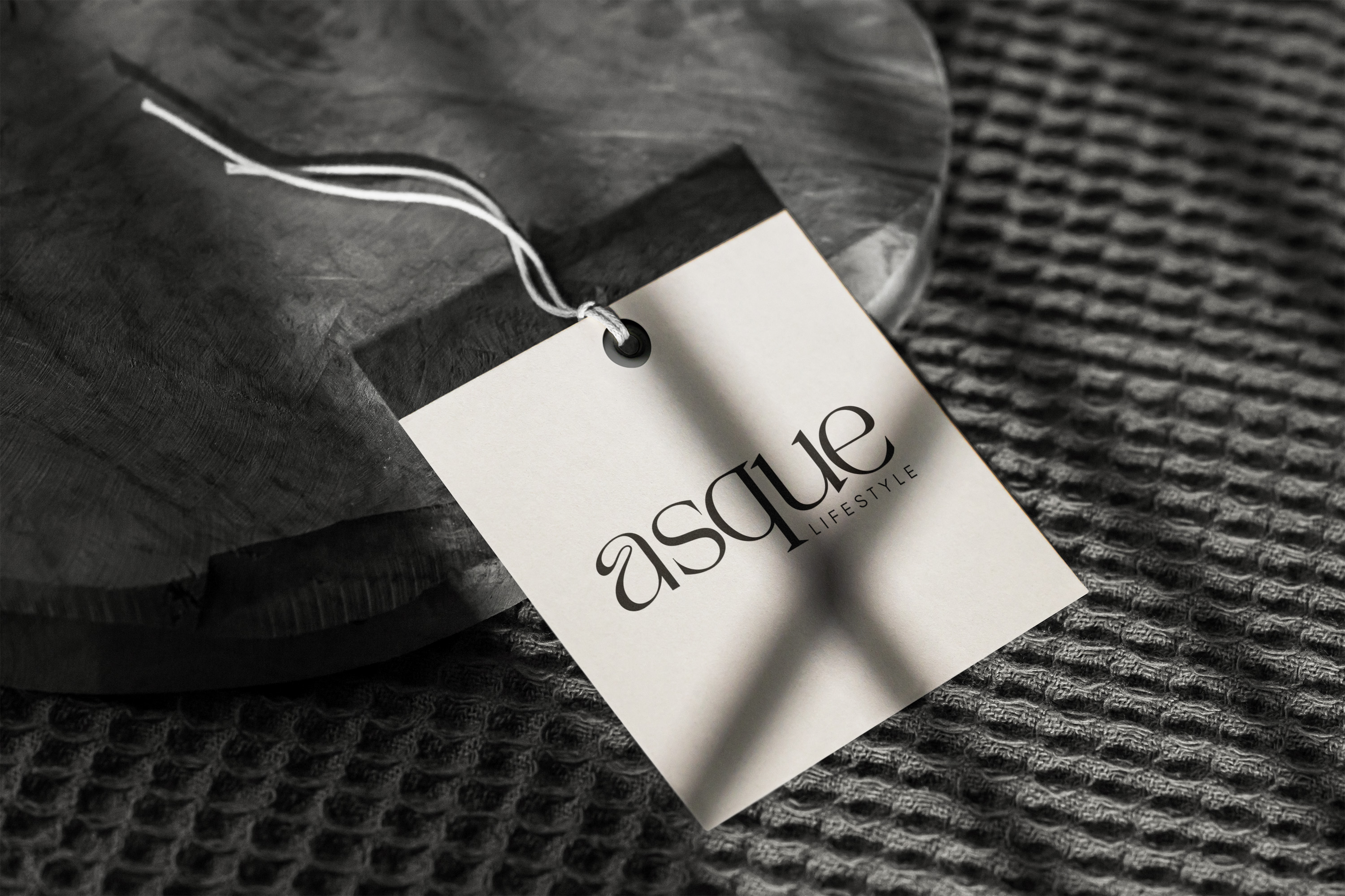
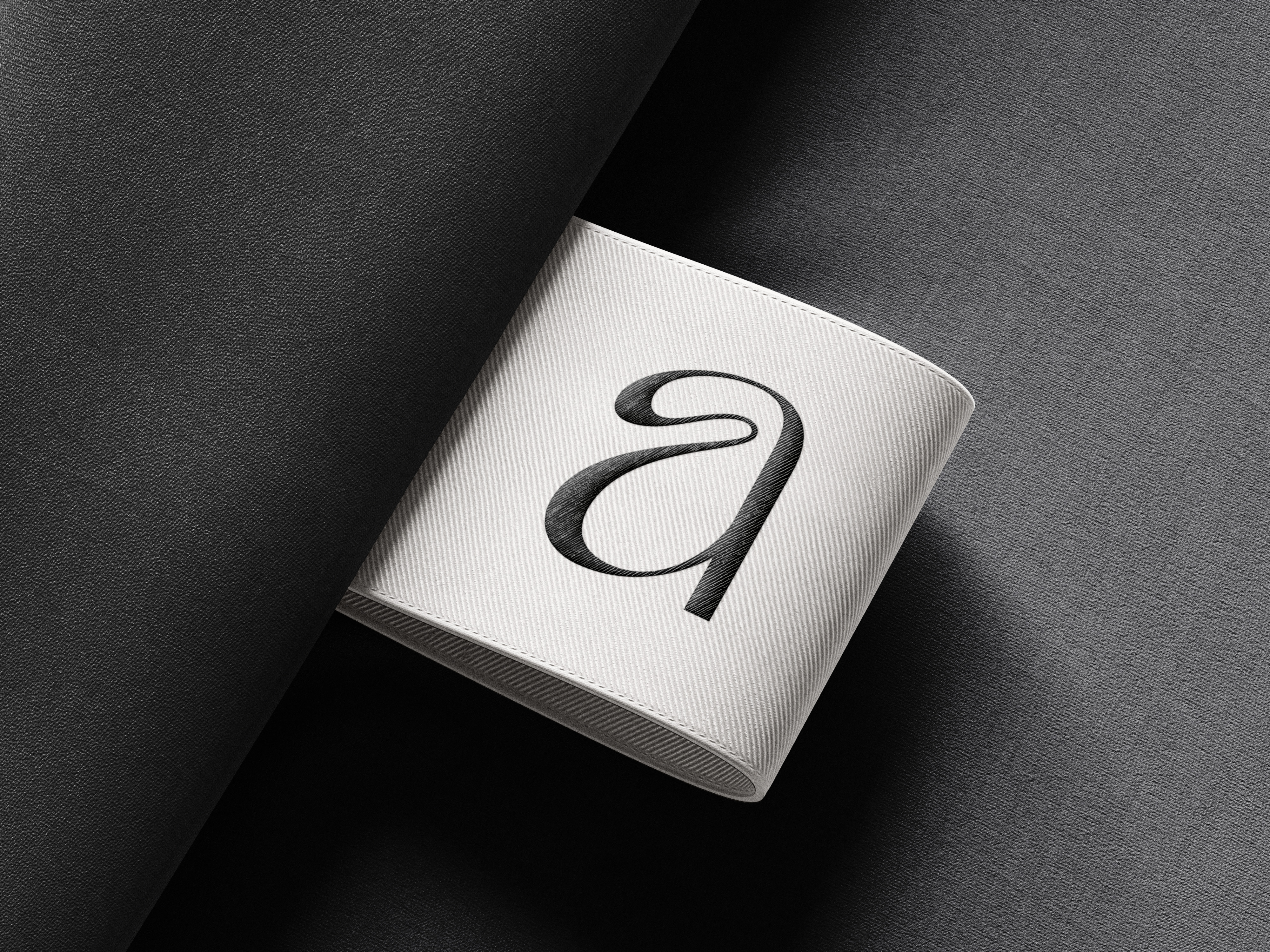
Built from the Ground Up
I developed the full visual identity, including the logo, typography, color palette, and brand guidelines, then extended the direction into packaging and branded materials. Keeping the elements simple allowed small details, proportions, and placement to carry more weight.
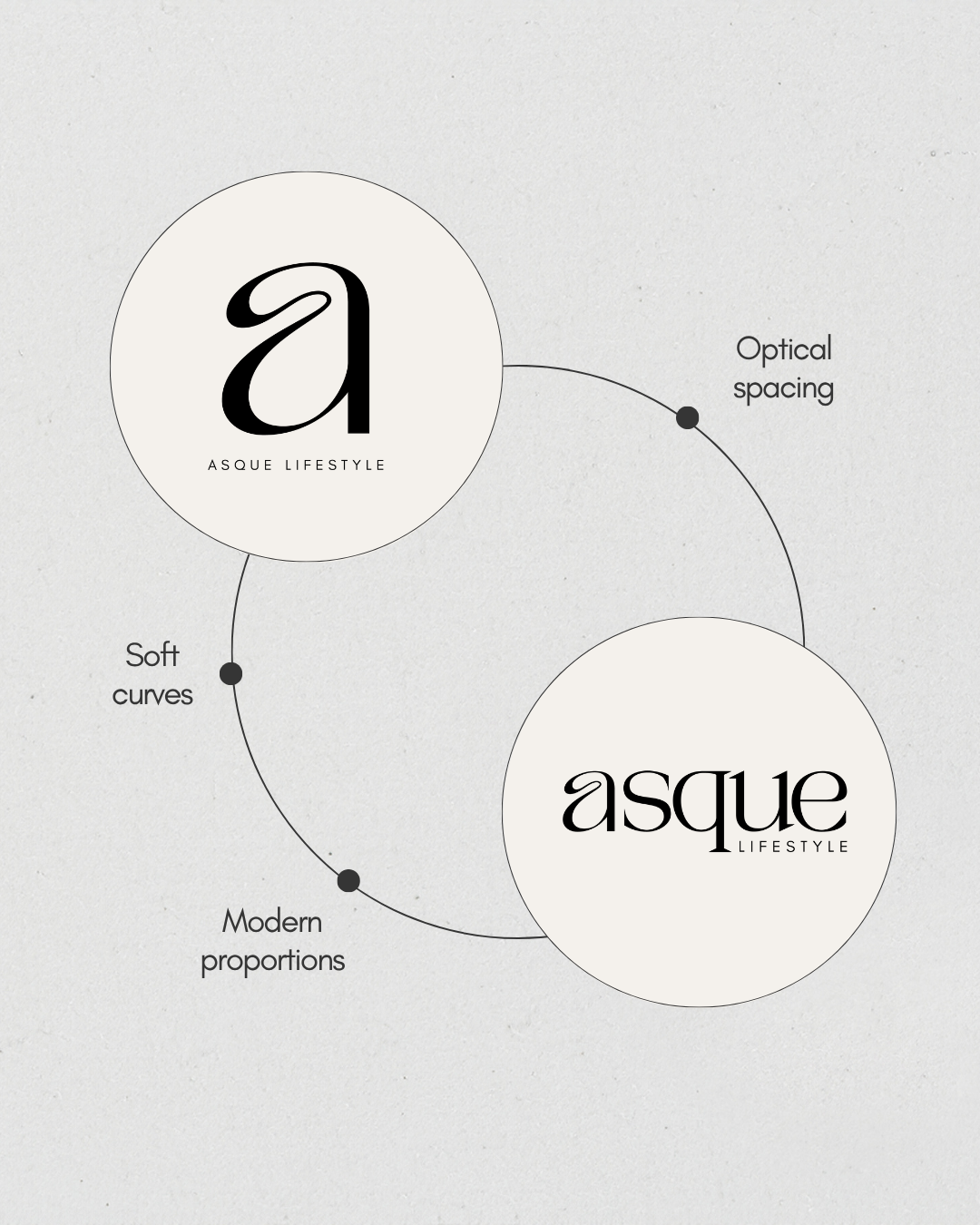
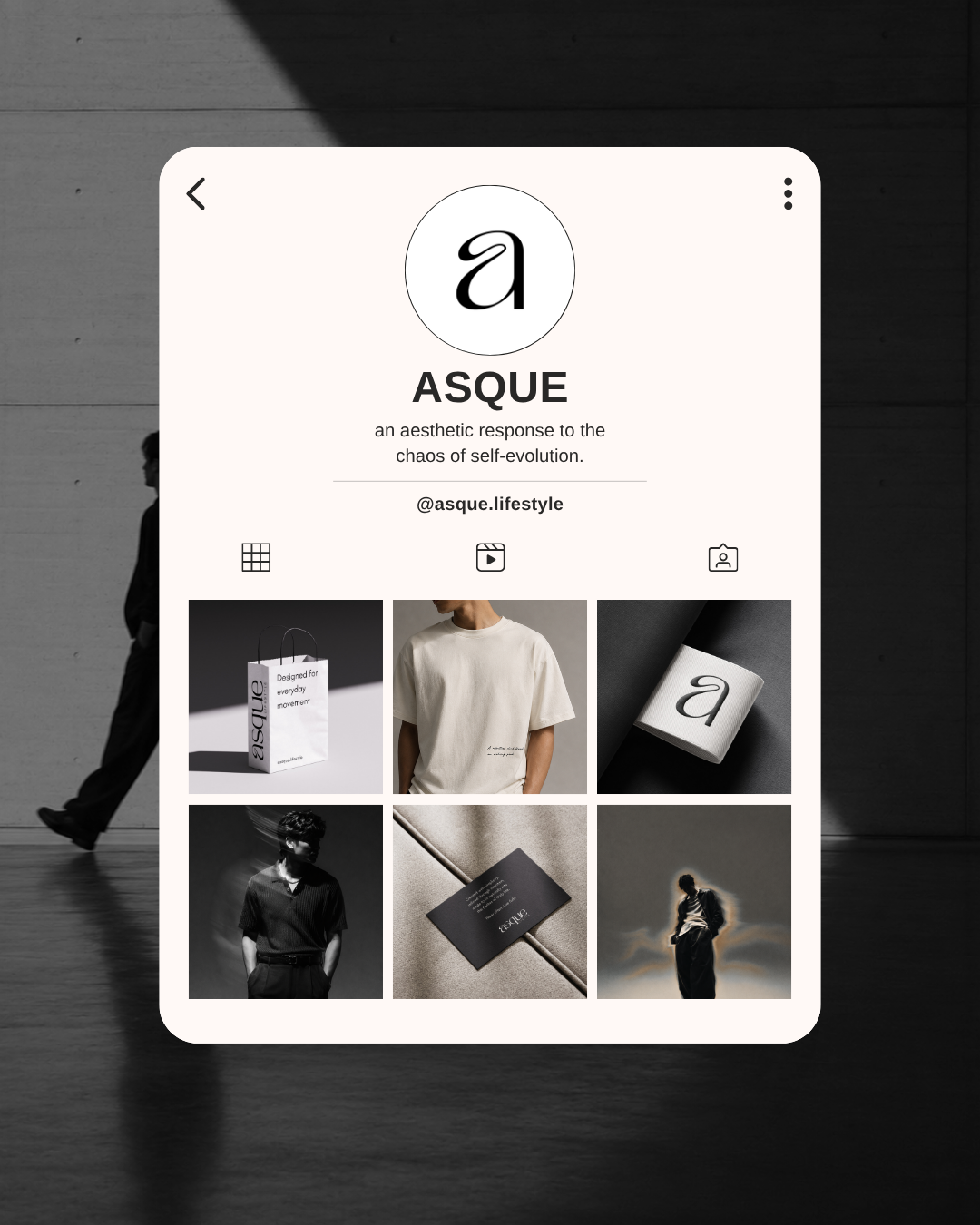
Made to Outlast a Season
Rather than building ASQUE around one collection or current trend, I created an identity that could move with the brand over time. The final direction feels recognizable without being restrictive, giving future collections room to develop while still feeling unmistakably ASQUE.