freedom ed NZ
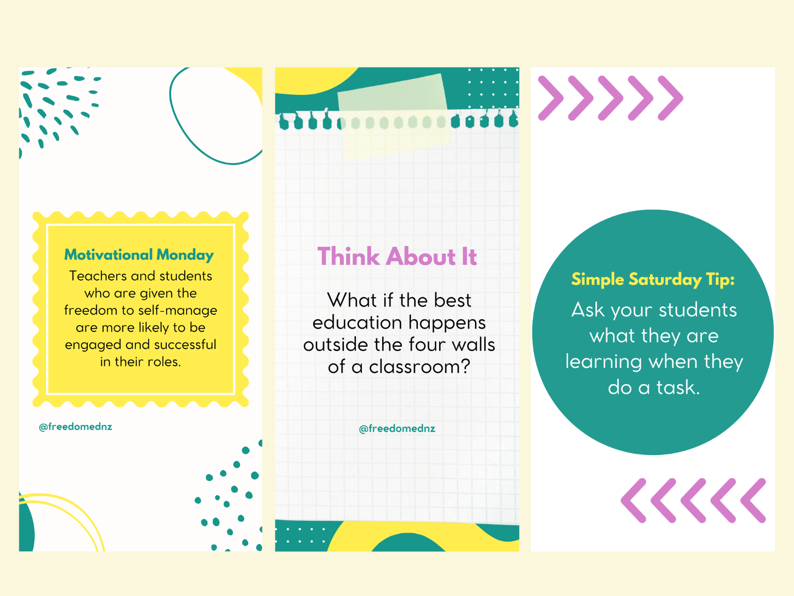
Learning Can Look Different
Because freedom ed NZ approaches education differently, I felt its visuals should too. I wanted to move away from anything overly formal or institutional and create content that felt easier to approach.
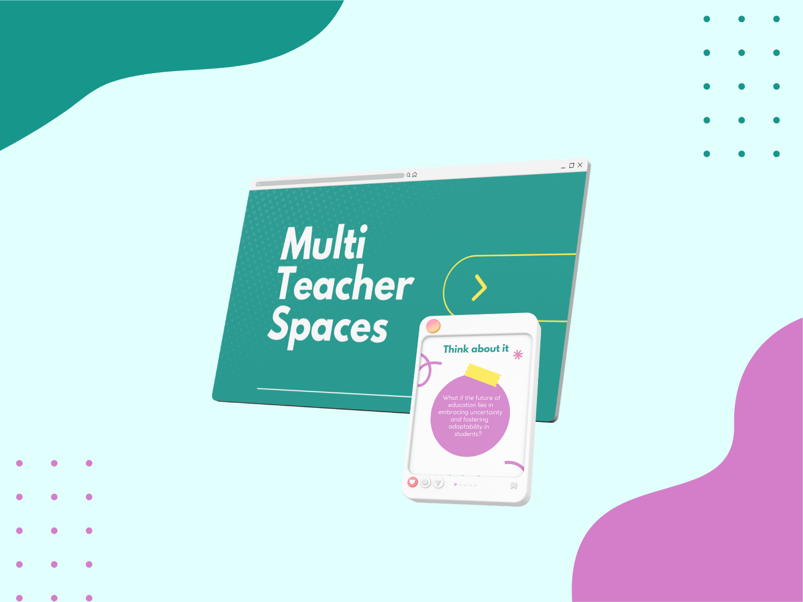
Room to Explore
Bright colors, bold typography, playful shapes, and flexible layouts shaped the direction. I kept enough structure for the information to stay clear, while giving the designs room to feel expressive and curious.
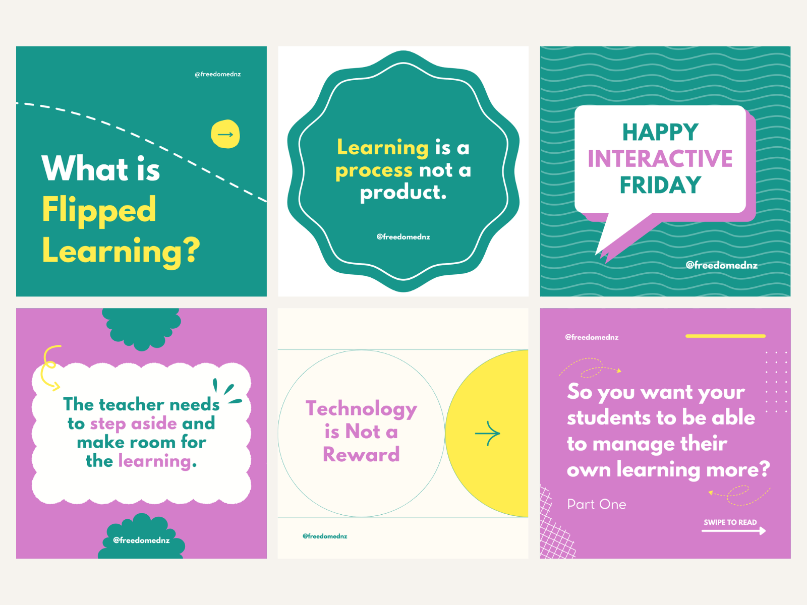
Big Ideas, Made Approachable
I designed social media graphics around different topics, messages, and educational ideas, finding ways to break information into visuals that were easier to take in. I also let the layouts change depending on the content instead of forcing every post into exactly the same template.
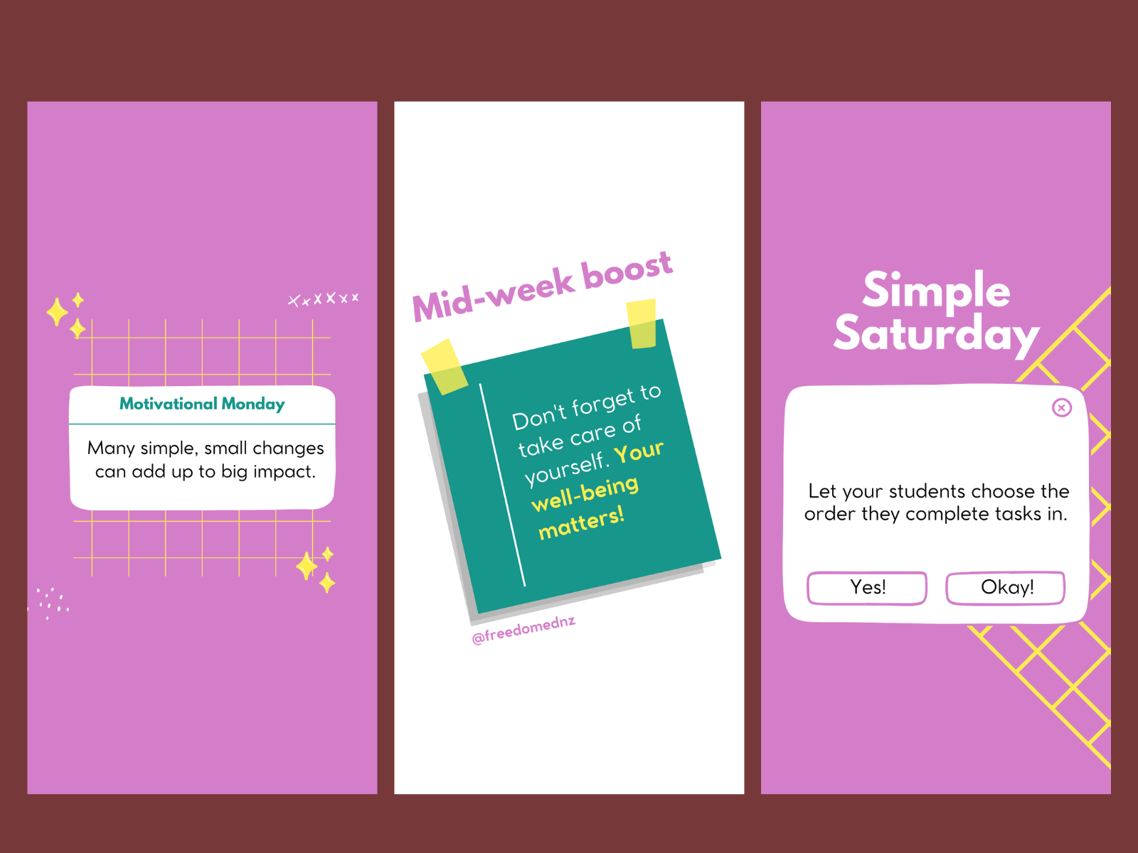
Making Curiosity Feel Inviting
The final direction gives freedom ed NZ a recognizable presence without making its content feel repetitive. It keeps information clear while bringing warmth, energy, and personality into topics that could otherwise feel too formal.