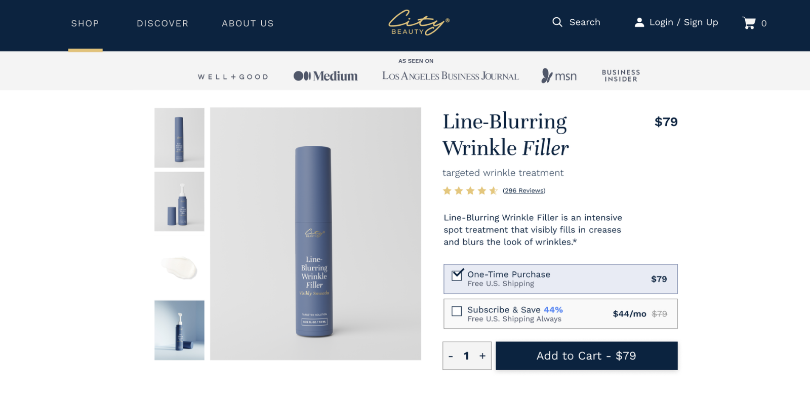
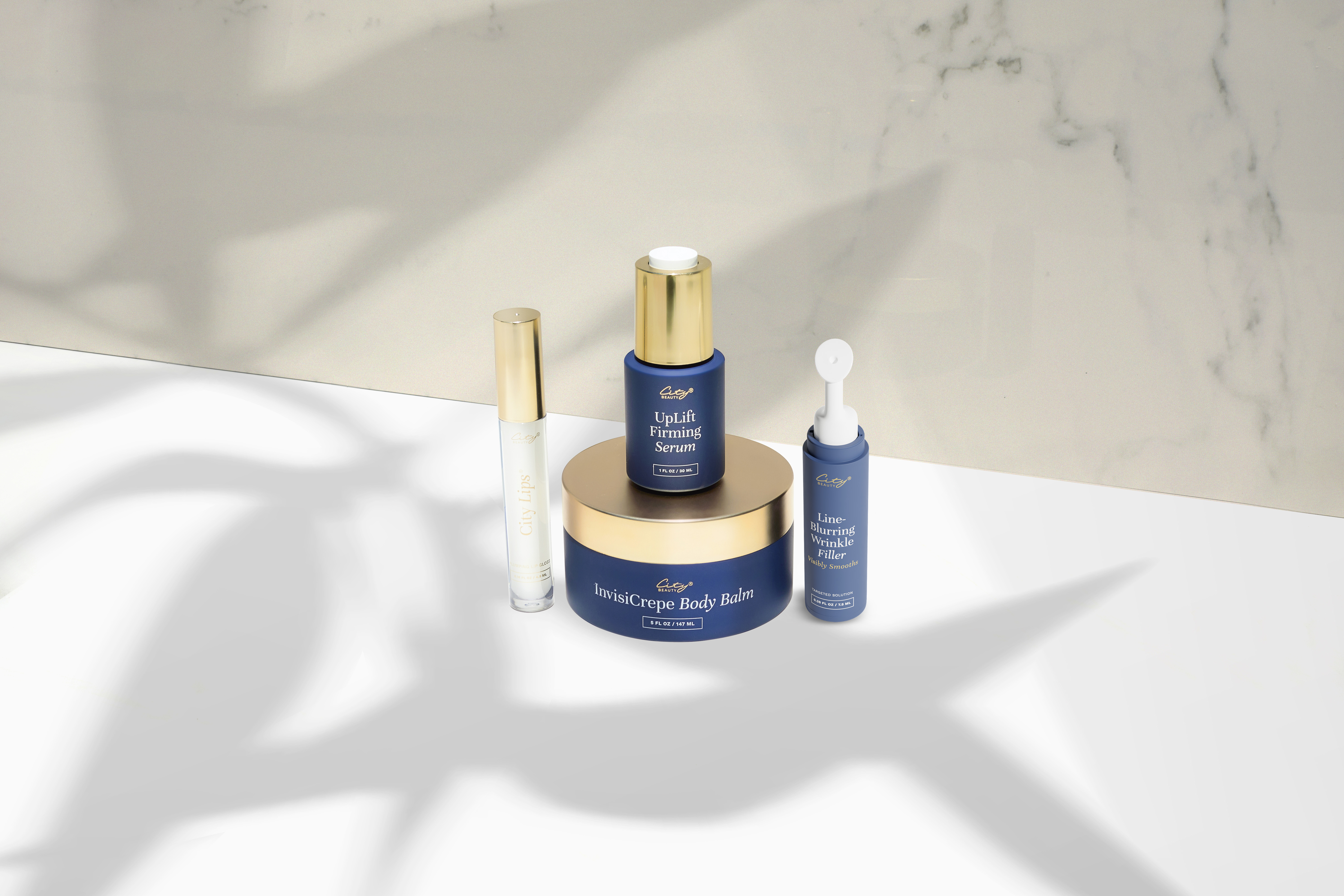
City Beauty
Creating in an Established World
City Beauty already had a strong visual identity, so the challenge wasn't to reinvent it. My focus was on finding new ways to work within that world and keep the content visually interesting across different products and campaigns.
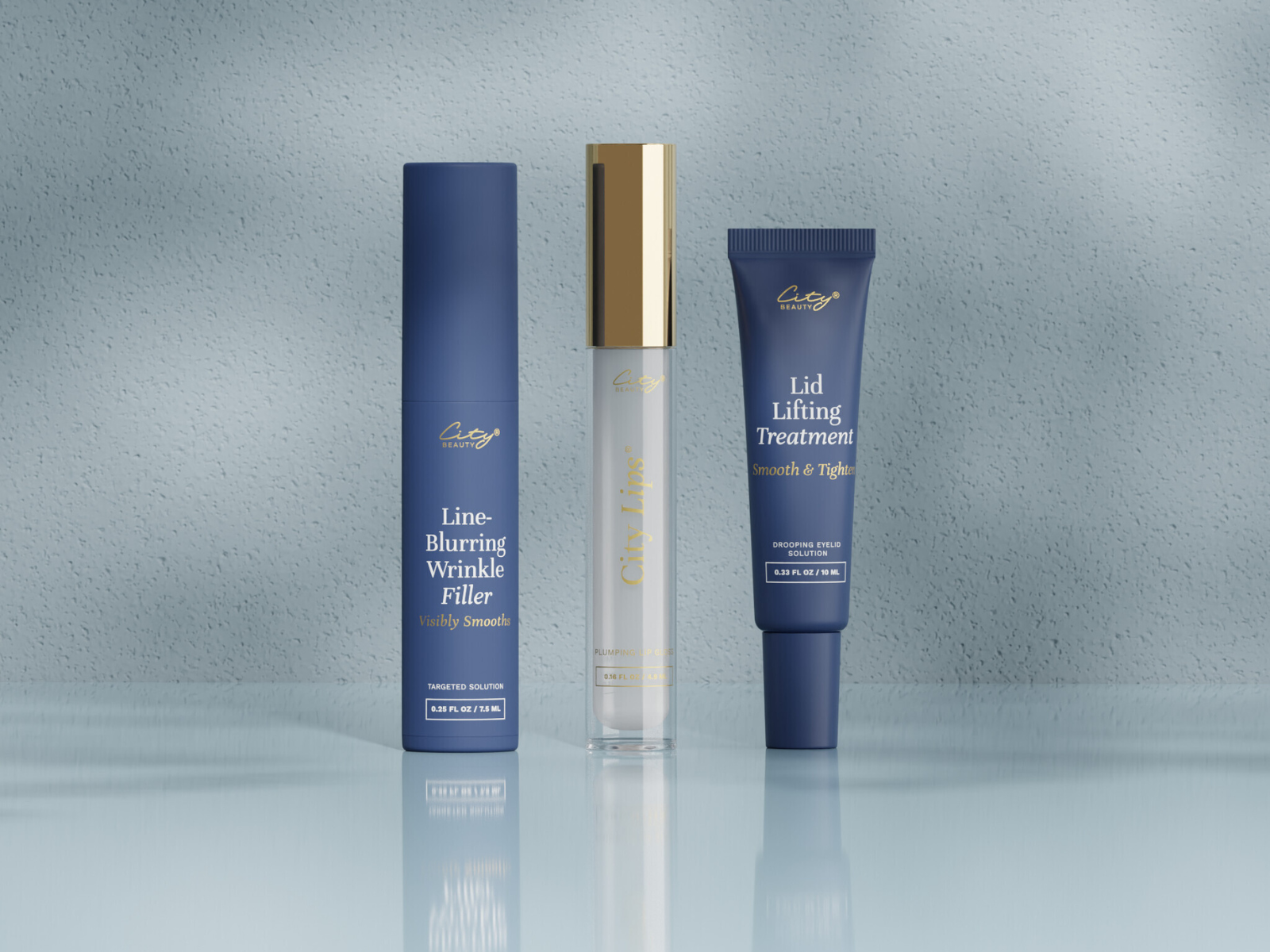
Polished with Purpose
I worked with the brand's blue palette, clean layouts, refined typography, and product-focused imagery. The direction needed to feel elevated while keeping the message clear and easy to take in.
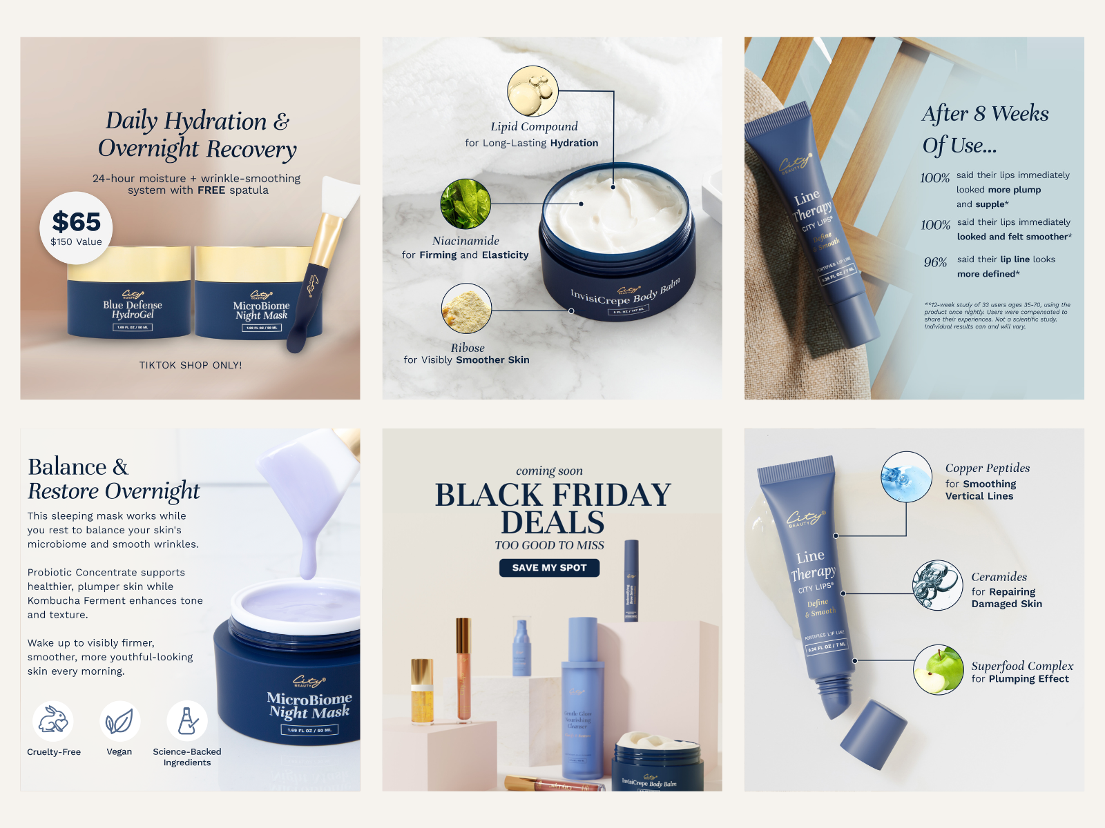
A New Angle for Every Product
I designed social media, digital, and marketing assets while exploring different compositions, product treatments, and ways of using typography. Working within established guidelines pushed me to find variety in the details rather than changing the identity itself.
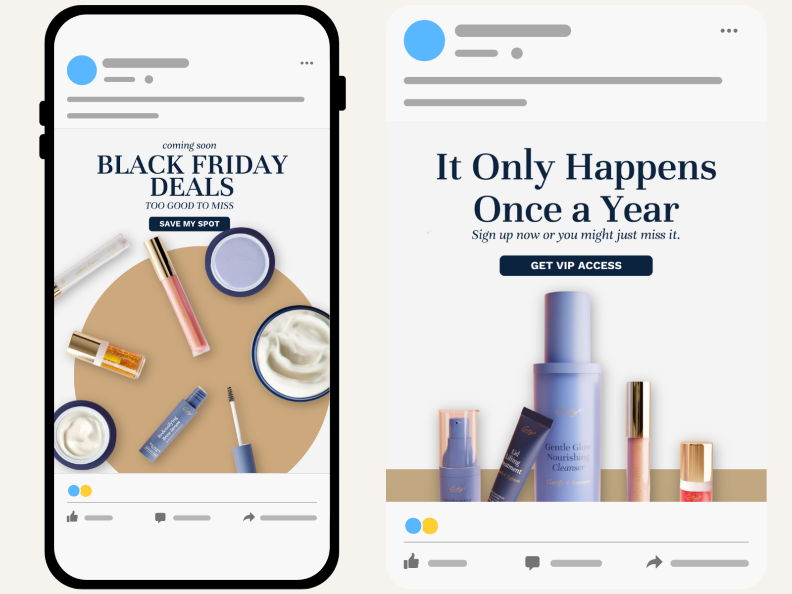
Fresh, but Still Familiar
I found ways to give campaigns and products their own visual moments while keeping everything recognizably City Beauty. The result was a range of creative assets that felt fresh without breaking away from the brand people already knew.